


Candlestick charts have become a popular tool for traders and investors to analyze price movements in financial markets. Understanding how to read candlestick charts is essential for anyone looking to make informed decisions based on price patterns and trends. In this guide, we will delve into the intricacies of candlestick charts, explaining their significance, and providing insights on candlestick charts explained for effective analysis.
What Are Candlestick Charts?
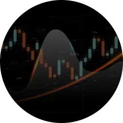
Candlestick charts are a type of financial chart used to represent the price movements of an asset, such as stocks, forex, or commodities, over a specific period. The chart consists of individual “candles,” each providing valuable information about the open, high, low, and close prices during a given time frame.
Anatomy of a Candlestick
- Body: The rectangular-shaped area between the open and close prices. It is typically filled or colored, indicating if the close price was higher or lower than the open.
- Wick (or Shadow): The thin lines extending above and below the body, representing the highest and lowest prices reached during the time period.
Now, let’s explore how to read candlestick charts and leverage this information for effective analysis.
How to Read Candlestick Charts

- A bullish candle is typically represented by a white or green body, indicating that the closing price is higher than the opening price.
- Conversely, a bearish candle is often depicted by a black or red body, signaling that the closing price is lower than the opening price.
The length of the wick provides insights into price volatility. A long upper wick suggests that prices rose significantly during the period but retraced, while a long lower wick implies a substantial drop followed by a recovery.
Candlestick charts often form patterns that traders use to predict future price movements. Common patterns include doji, hammer, shooting star, and engulfing patterns.
A series of candles can indicate potential trend reversals. For instance, a sequence of bearish candles followed by a bullish candle might suggest a reversal from a downtrend to an uptrend.
Benefits and Drawbacks of Candlestick Charts
Benefits
Visual Representation:
- Candlestick charts provide a visually intuitive representation of price movements, making it easier for traders to interpret and analyze compared to traditional line charts.
Comprehensive Information:
- Each candle provides comprehensive information, including the opening, closing, high, and low prices, giving traders a holistic view of market activity.
Pattern Recognition:
- Candlestick patterns enable traders to recognize potential trend reversals, continuations, or market indecision, aiding in making more informed trading decisions.
Drawbacks
Complexity for Beginners:
- For beginners, the array of patterns and candlestick combinations may seem overwhelming. Learning to interpret these patterns takes time and practice.
Not Standalone Indicators:
- Candlestick charts are most effective when used in conjunction with other technical analysis tools. Relying solely on candlestick patterns may lead to incomplete analyses.
Subjectivity:
- Interpretation of candlestick patterns can be subjective, leading to different analyses by different traders. Consistency in interpretation is crucial for accuracy.
FAQs
Candlestick charts are a type of financial chart that represents the price movements of an asset over a specific period. They consist of individual “candles” that provide information about open, high, low, and close prices.
To analyze a candlestick chart, identify bullish and bearish candles, understand wick length for volatility, recognize candle patterns, and look for trends or potential reversals.
The 3 Candle Rule refers to a pattern where three consecutive candles of the same color indicate a strong trend. For example, three bullish candles suggest a strong uptrend.
Candlestick charts are used for technical analysis in financial trading. Traders use them to identify patterns, trends, and potential price reversals, aiding in decision-making.
Conclusion
Learning how to read candlestick charts is a valuable skill for traders and investors. The visual representation and comprehensive information provided by candlestick charts make them powerful tools for technical analysis. While they have their complexities and subjectivity, with practice and understanding, investors can leverage candlestick charts to gain insights into market dynamics and make well-informed trading decisions. Always remember to use candlestick charts in conjunction with other analytical tools for a more comprehensive approach to market analysis.

Thank you I have just been searching for information approximately this topic for a while and yours is the best I have found out so far
The complex interpretations defined in such simple and easy to understand words. Really praiseworthy
Your blog post was really enjoyable to read, and I appreciate the effort you put into creating such great content. Keep up the great work!
I started paying more attention to candlestick charts recently when trading a few UK shares. The explanation of the candle body and wicks made things clearer for me. Simple but helpful guide, thanks for sharing.